Frontend developers & designers
Keep Design Tokens and Mockup References Visible While Coding UI
Translating a design mockup into frontend code requires constant cross-referencing between hex codes, spacing units, responsive rules, and visual mockups. Pinning a compact FloatBoard workspace beside your editor keeps key tokens and visual references in immediate view without switching windows or splitting narrow laptop screens.
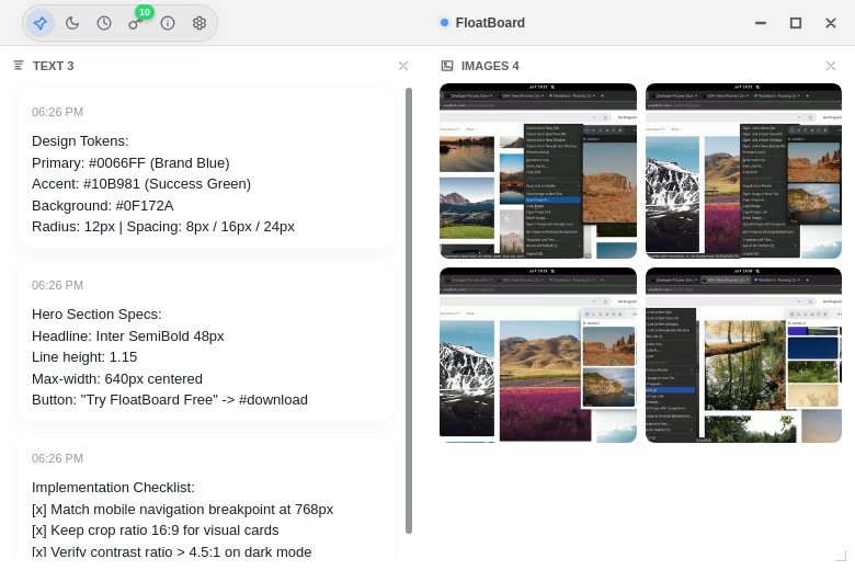
Keep the active design tokens in immediate sight
When implementing a new component or landing page section, write down the three or four variables you will reuse most: brand primary and accent hex codes, surface background colors, default border radiuses, and padding steps. Storing these in a short FloatBoard text card keeps the exact values visible without requiring you to repeatedly inspect design files or search global stylesheets.
A working card should contain values for the immediate task, not the entire design library. If a token is already standardized in your framework's utility classes or CSS custom properties, note only the token name or active override. This keeps the reference card compact and legible beside your editor window.
Pair exact text rules with visual mockup crops
Specifications on their own lack visual context, while full design boards consume too much screen area. FloatBoard's two-column layout pairs text specification cards on the left with image reference tiles on the right. You can crop the specific desktop and mobile views of the component you are implementing and drop them into the image section.
Seeing the target spacing, typography hierarchy, and visual balance alongside the exact CSS values helps you catch alignment discrepancies early. Because the image tiles remain pinned, you do not need to hide your code editor or browser devtools to verify button margins or card paddings.
Avoid constant window flipping between Figma and the IDE
Switching back and forth between a heavy design tool and a code editor disrupts focus and slows down frontend styling. On a single laptop screen, splitting the display evenly between an editor and a browser leaves little room for a third full application window.
FloatBoard stays on top as a lightweight overlay. You can pin it near the top or side of your editor, check color codes or target alignment, and continue typing in your code editor without losing keyboard focus. When you finish the component, minimize or hide the board with a single click.
Retain only what the current component needs
A floating board works best as a transient working surface rather than a permanent asset archive. Keep your comprehensive design files, vector assets, and full Figma links in your project repository or task tracking tickets. Place only the immediate component's tokens, breakpoints, and visual references on the active board.
Overloading the board with dozens of unrelated screenshots defeats the purpose of rapid visual reference. When a card has served its purpose, remove it to keep the interface clean and easy to scan.
Update the working set between frontend components
Once the component styling is verified in your local browser and passes responsiveness tests, clear or update the references for the next task. FloatBoard's built-in history preserves deleted items so you can retrieve a previous token note if needed, while your active surface stays clean.
If your workflow also involves capturing transient debugging screenshots or copying error traces, see the code snippets and screenshots guide. For broader image comparison workflows, explore the image reference organizer guide.